

So in the last post, we discussed a wonderful tool called curve fitting. We concluded the post with a question, how to choose the curve which fits the data points the best. In the previous example, it was easy because we knew beforehand that we have a linear relation between V and I. Let's see another example. For this example, I am choosing the Voltage and Power relation of a solar panel. For solar panels the Voltage and Current relation are not linear so is its relation with power. The significance of this graph is that it is used in MPPT(Maximum Power Point Tracking). A solar panel doesn't deliver the same amount of power at every voltage. The power output of a solar panel is maximum only at a particular voltage which depends on a lot of other conditions like temperature, intensity of the sun etc.
There are a number o f methods to calculate the maximum power point of a solar panel. In this post, I am trying to use curve fitting tool to find the maximum power point of a solar panel. Let's start with taking a few readings from solar panel at different Voltages.
| VOLTAGE(V) | POWER(W) |
| 0 | 0 |
| 5 | 40 |
| 10 | 80 |
| 15 | 120 |
| 20 | 160 |
| 25 | 198 |
| 30 | 140 |
I have taken this values from a V-P curve of a 200W solar panel. Now lets start with programming. First let's create two arrays to represent voltage and power.
>>> V = array([0,5,10,15,20,25,30])
>>> P = array([0,40,80,120,160,198,140])
Now let's use the polyfit() tool to find the curve fitting the best. Let's start with linear fit.
>>> c = polyfit(V,P,1)
>>> P_calculated = polyval(c,V)
>>> plot(V,P,"bo")
[]
>>> plot(V,P_calculated)
[]
>>> show()
The output graph is as given below. Blue dots represents the data read and the curve represents calculated values.
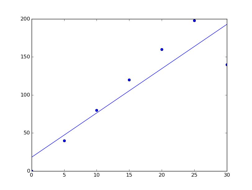
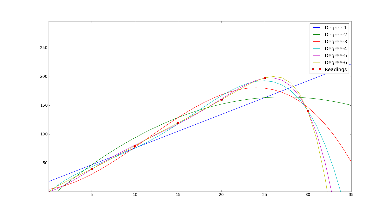
As you can see the linear graph is quite good. But is it the best fit? We can see that last point at 30 is pretty far from the line. Also, since we actually have an idea about the shape of the graph we know this is wrong. So let's try other graphs. Let's plot the curve at different degrees.
>>> V2 = array([i for i in xrange(35)])
>>> V2
array([ 0, 1, 2, 3, 4, 5, 6, 7, 8, 9, 10, 11, 12, 13, 14, 15, 16,
 17, 18, 19, 20, 21, 22, 23, 24, 25, 26, 27, 28, 29, 30, 31, 32, 33,
 34])
>>> c1 = polyfit(V,P,1)
>>> c2 = polyfit(V,P,2)
>>> c3 = polyfit(V,P,3)
>>> plot(V,P,"ro",label = "Readings")
[]
>>> plot(V2,polyval(c1,V2), label = "Degree 1")
[]
>>> plot(V2,polyval(c2,V2), label = "Degree 2")
[]
>>> plot(V2,polyval(c3,V2), label = "Degree 3")
[]
>>> legend(loc = 'upper right')

>>> show()
Here we have used a new array to calculate the power using the coefficients got from poylfit() so that we will get a smoother curve. We have calculated curve with degrees 1,2 and 3. And plotted it for comparison. The plot is added below
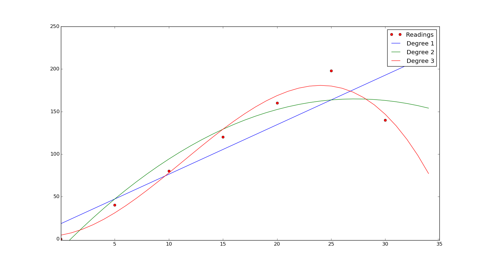
As you can observe from the graph the best fit is when we use the cubical relation for finding the curve. Is it the best? What if we use a 4th-degree polynomial fit? It is not easy to eyeball the output every time. Is there a solution to this problem? The answer is yes, there is. We can decide the goodness of fit using the coefficient of determination (denoted by R2). We can find it by
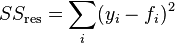
where y represents each data point we have and f represents predictions we made for each corresponding data points
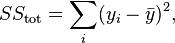
here also y for each data point and y represents the mean of data points, then
Closer this value to the one better our fit is. Let's write a function to calculate R2.
def rSquare(measured, estimated):
    """measured: one dimensional array of measured values
       estimate: one dimensional array of predicted values"""
    SEE = ((estimated - measured)**2).sum()
    mMean = measured.sum()/float(len(measured))
    MV = ((mMean - measured)**2).sum()
    return 1 - SEE/MV
Let's find the R2 for each degree
>>> rSquare(P,polyval(c1,V))
0.82008434162298505
>>> rSquare(P,polyval(c2,V))
0.92271968890815703
>>> rSquare(P,polyval(c3,V))
0.9779194419264573
>>> c4 = polyfit(V,P,4)
>>> rSquare(P,polyval(c4,V))
0.99623615654435815
>>> c5 = polyfit(V,P,5)
>>> rSquare(P,polyval(c5,V))
0.99971097886204496
>>> c6 = polyfit(V,P,6)
>>> rSquare(P,polyval(c6,V))
1.0
As you can see when we used a 6th-degree polynomial curve we get R2R^2 as 1. Let's just plot all this and see the difference.
Since we have found a good fit now let's find the maximum power point. Recalculate the power for more voltage points. We can use the V2 we created earlier for this.
>>>P_ = polyval(c6,V2)
>>> list(P_).index(max(P_))
26
>>> max(P_)
200.41482240000522
>>> V2[26]
26
So we can see that the maximum power point is around 26V and the maximum power is 200W. You can cross reference this with P-V curve we used to create this table. This is just an example to show how we can use this tool to find the relation between data. Anyway instead of using 6th-degree polynomial even if we had used 4th degree or 5th degree we would have got a pretty good answer. In this kind of experiments even if we get an answer, it might not be 100% accurate, because there could be an error in readings, as the number of readings changes the curve could also change. In general more the number of points, we would get a better curve. Also, an R2 value of .9 or above could be considered a good enough fit. You might be thinking what is the point in doing all this if we can't find the exact answer. Yeah, you don't find the exact answer, but you have considerably reduced the area in which you got to search for the answer. In this particular answer, maximum power point might not be 26V but it will be in close proximity to that and it reduces a lot of work.